Watch Out for Fakes
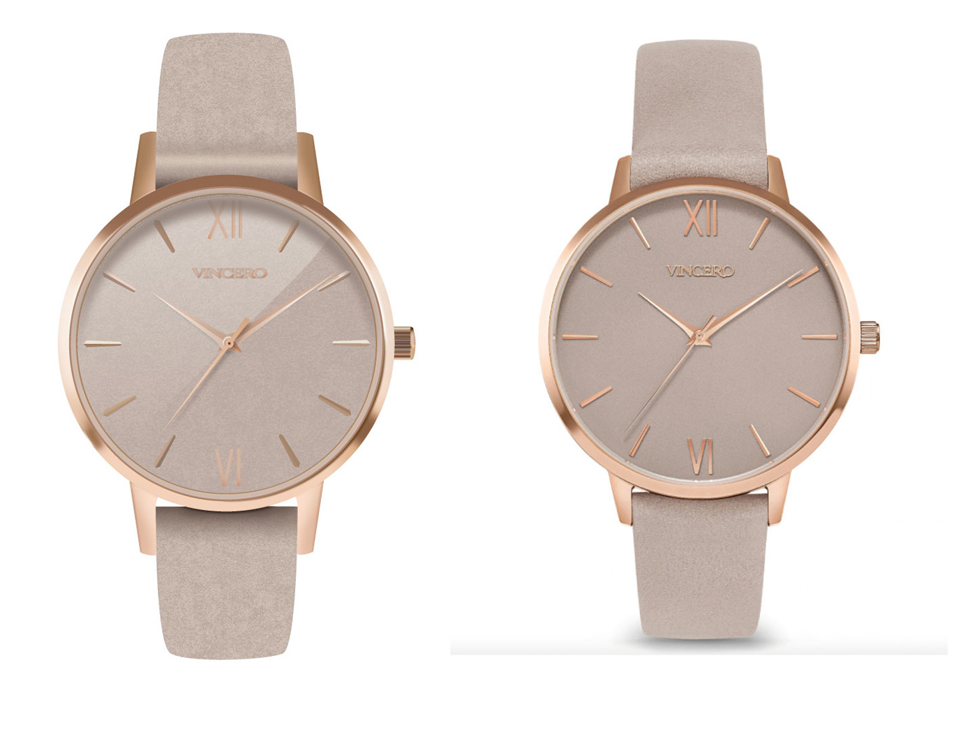
For this project my goal was to make a photorealistic looking watch using only vector graphics. This task seemed daunting at first, almost impossible I might add. But after about 40 hours of work, I am happy with my results. To begin, I used this beautiful Vincero watch as my inspiration! I loved how simple it was yet elegant. My objective in creating this watch was to maintain its classy and luxurious appearance. The difficult part of creating a watch is that it has many reflections, highlights, and shadows. While doing this project I hoped to gain a better understanding of the tools available in Illustrator and how to create a realistic graphic.
To the sketch book!


Just like any other Illustrator project it is imperative to start with drafting. The drafting process was really helpful because it helped me to see the watch in pieces instead of just one whole object. I started to notice the shapes of things. For example, the little knob on the side of the watch is made up of lots of tiny, elongated hexagons. I got close to the watch to see how many circles were stacked on top of one another. After, I imported these sketches into Illustrator and began drafting.
A watch is born


In the first drafting stage focused on using basic shapes to create the structure of the watch. I also was careful about using rulers and guides to ensure that everything in the watch was symmetrical. The rotate and reflect tools proved to be extremely helpful in this process. I also found a font that was similar to the brand Vincero. I did the roman numeral styles letters on my own using rectangles. I was very pleased with how my watch was coming together after the first draft.
Improvement
Based on the previous draft I received the feedback to shorten the hands just slightly, so they are less pointed as well as fix their coloring. I was also told to move the lugs underneath the rim of the watch and round out the edges of them more. Although I hadn’t quite gotten to any of the shading yet, it was suggested that I use mostly shapes rather than just gradients to create the metal rim of the watch. Last, I was told to individually shade the elongated hexagons on the knob of the watch to add contrast and then add various gradients above that. I took all of that feedback and edited my first draft until I got this:
Application
I tried my best to color match the knob from the watch photo and then added a gradient above it. This little knob took me a long time to do. It was difficult to add multiple different gradients on top of lots of little, tiny pieces. However, after reaching out to a few peers for help I was able to accomplish my goal.

I also fixed the lugs and made the corners more rounded and fixed the shapes and color of the watch hands.

Final Product

After hours of work and fine editing this is my final result. I am happy with the way it turned out and think that it looks like a photorealistic watch. I focused on using warm, rich colors and using multiple layers and masks to give the watch a subtle but realistic metal look. I was able to add highlights or shadows in specific areas by using the draw inside tool. I gained a greater capacity to problem solve and feel more comfortable in Illustrator. I learned how to use tools such as masks, contrast, blurs, textures and gradients. I also really loved the texture I found and made the biggest difference in making it look photo realistic.There is obvious improvement from the first draft to the final and I am happy with the result. I cannot wait to continue expanding my Illustrator skills!

